How I Built a $10K Portfolio in Claude Code in 2 Hours
Two free skills, one reference folder, and the exact prompts I used to ship a $10K-tier animated portfolio in Claude Code. No agency, no boilerplate.
By Abhijit
Home
Two free skills, one reference folder, and the exact prompts I used to ship a $10K-tier animated portfolio in Claude Code. No agency, no boilerplate.
By Abhijit
A $5,000 agency portfolio is now a two-hour Claude Code session — if you install two design skills, feed it the right references, and write one specific build prompt. Default Claude output ships the same purple-gradient, Inter-font, rounded-card aesthetic every AI builder produces; the fix is a 10-minute setup that re-routes the model around its own clichés. Every freelance developer pitching design-conscious clients in 2026 needs this stack live before the next portfolio review.
This is the actual workflow I used to ship my own portfolio — every prompt I sent, every bug I caught, every fix I asked for. No abstract template guide.
Claude Code's out-of-the-box design taste is mediocre by construction. Same fonts, same flat hero, same rounded cards. The model has seen ten million Vercel templates and averages them.
Two skills break that average:
Stack them and Claude stops defaulting to its safest taste profile. That single change is what separates a portfolio that looks like a developer's weekend project from one that looks like a $5–10K agency build.
Open Claude Code and paste these two install commands. Approve the prompts. Install globally so every project inherits the skills.
Install this skill: github.com/anthropics/skills/tree/main/frontend-design
Install this plugin using NPM: github.com/nextlevelbuilder/ui-ux-pro-max
Switch Claude Code into Auto mode so it stops asking permission at every step. The friction of approving 40 tool calls in one build will kill your momentum and your build quality.
Anti-slop stack, defined: the pairing offrontend-design(Anthropic) for background taste enforcement plus a visual-variation skill likeui-ux-pro-maxfor explicit style selection — the two-skill minimum that keeps Claude Code from generating an AI-template aesthetic.
Do not describe your dream site from scratch. Show Claude what good looks like.
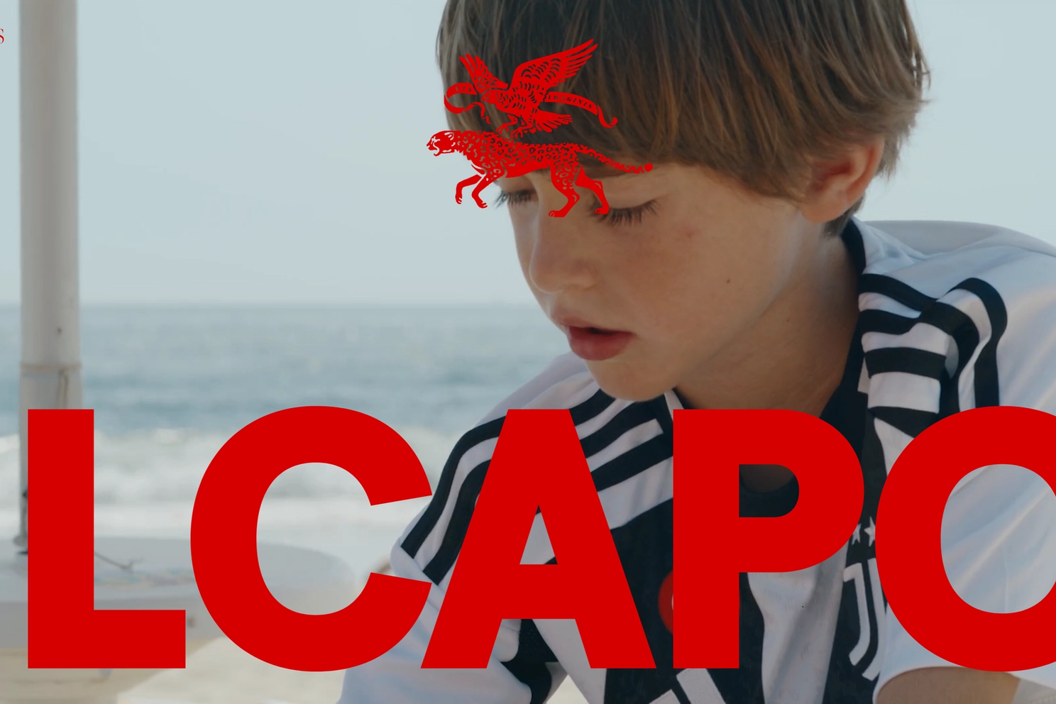
For my portfolio I used Il Capo Production on Awwwards as the anchor — dark, cinematic, restrained motion. I did not screenshot the whole site and tell Claude "make me this." I went section by section and grabbed only what worked.
The actual breakdown of my /reference folder:
The Pinterest substitution matters. Borrow what works from each source — don't try to clone one site. A reference folder beats any natural-language description because Claude can match composition, color temperature, and rhythm directly from the image instead of reverse-engineering your adjectives.
Drop everything into a /reference folder at the project root.
Start with /ui-ux-pro-max to activate the design skill. Then write a prompt that maps every reference file to its target section and ends with one specific instruction.
Here is the exact prompt I used:
/ui-ux-pro-max
Build a premium personal portfolio website for a frontend developer.
It should look expensive, modern, and technically impressive, with
elegant animations that load well on any device.
Use the design references from the /reference folder:
1.png — hero section
2.png — section under hero (work shown as video + title/description)
6.png — footer
7.png — portfolio page with full list of works
11.png — individual project page
12.png — loading screen
In the hero, place me in the center using me.png. For all
work/project image placeholders, use example.png.
Ask me any clarifying questions you need before building.
The last line is the load-bearing instruction. Claude pauses and asks four to six questions about typography, sections, animation level, and tone. Your answers become the spec for the entire site — be specific here, because every vague answer turns into back-and-forth fixes later.
After answers, Claude spends roughly five minutes planning and ten minutes building. The first output is already shippable as a v0.
A static portrait in the center of a dark hero is dead. Something has to happen on cursor move.
I designed the Flashlight Effect: the hero is dark, the portrait is barely visible, and the cursor acts as a soft-edged spotlight that reveals a brighter, warm-lit version of the same photo underneath. Two image layers, one circular mask, one cursor tracker.
The prompt I sent:
In the hero section, I want a flashlight/spotlight cursor effect.
Dark background. My photo is barely visible by default. When the
cursor moves over the section, it acts as a spotlight — revealing
a brighter, warm-lit version of the photo underneath through a
soft-edged circular mask that follows the cursor. Radius 100–150px,
soft feathered edges. Implement this.
Claude built it in one pass. The pattern that worked: describe the visual concept in physical terms (flashlight, soft-edged mask, feathered radius) rather than CSS terms (radial-gradient, blend-mode). The model picks the right implementation faster from the concept than from the technique.
Before running any formal quality check, scroll the site yourself and write down everything that feels off. My list after the first build:
Send everything in one message, not four. Sequential one-fix prompts cost more tokens, lose context between turns, and produce inconsistent visual decisions. Bundled fixes give Claude the full pattern of issues and let it solve them as a system.
The Gridpulse Brief — every Friday, a clean breakdown of the agentic dev tools shipping that week and the ones quietly breaking production. Join readers building with AI without the slop. → Subscribe here
Once the obvious bugs clear, run a structured grade against the criteria that actually predict whether a portfolio looks expensive:
Review this site against these criteria and be honest:
- Typography (overused AI fonts like Inter?)
- Color (restrained palette or all over the place?)
- Hierarchy (does text sizing guide the eye?)
- Animation (smooth and intentional, or choppy?)
- Mobile (designed for phones, not just shrunk?)
- Copy (specific, or generic AI filler?)
Claude grades each axis. Read it, agree or disagree per point, then collect every point you agree with into one fix prompt. Do not ask Claude to fix points you disagree with. Your taste is the final filter — the skill does not override it.
Within twelve months, the agencies billing $5,000 for portfolio sites will compete with a junior dev who pasted two skills into Claude Code and shipped overnight. The moat shifts from "who can build it" to "who has the taste to direct it." The reference folder you curate now is the asset that compounds — every future site you build inherits it, and every client you pitch sees the upgrade.
The question worth asking before your next freelance pitch: is your portfolio a result of your taste, or a template you didn't choose?

Early research on AI and cognition suggests offloading to chatbots can weaken recall, persistence, and problem-solving. One MIT study found essay writers using gen AI performed worse over time.
Xbox loses 64 cents on every dollar and just cut 3,200 jobs. Here's why even the biggest game launch in history can't fix gaming's broken economics.

Google's Gemini Omni Flash generates and edits video in conversation at $0.10/second. Here's what the API actually delivers — and where 720p hits a wall.
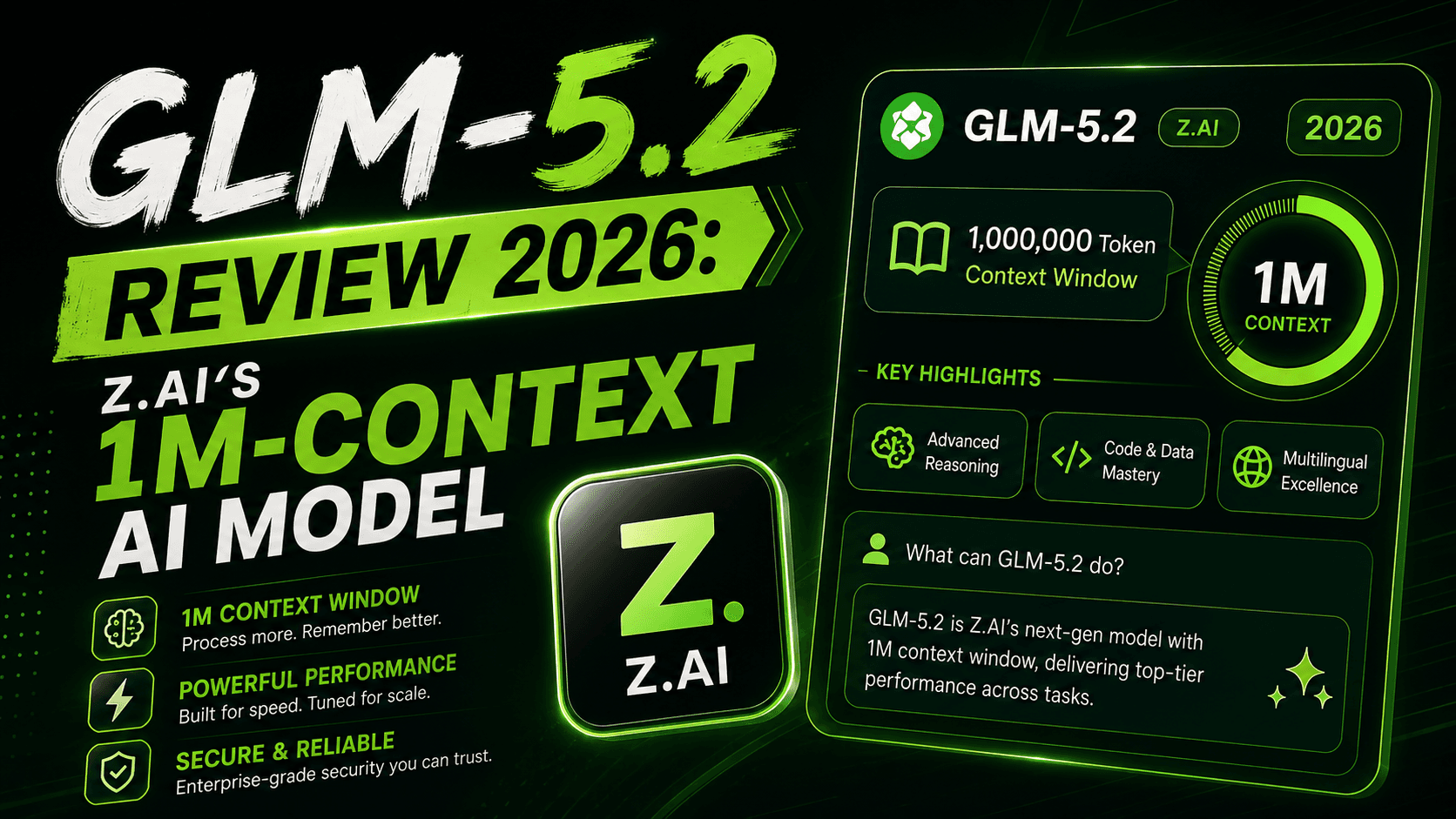
Z.ai shipped GLM-5.2 with a 1M-token context window and zero benchmarks. Here's what's confirmed, what's hype, and whether to switch today.
Anthropic's 11 Cowork plugins erased a real margin pool overnight. The mechanism, the casualty list, and what it does to Indian IT services next.
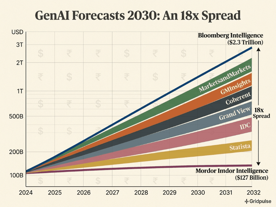
Bloomberg sees $2.3T. Mordor sees $127B. The same market, the same year — here's why every generative AI forecast through 2030 is fighting a different war.
Get weekly curations of the best articles, resources, and insights directly to your inbox about AI, Tech, Finance & Business.